Creating Unforgettable Brands: Boosting Brand Salience with Conversion-Centered Design
9 Min ReadLet’s be brutally honest. Your brand awareness score is the most useless, misleading, and expensive vanity metric in marketing. Brands spend millions blasting their logo across every available channel, proudly reporting back to the board that millions of people have “seen” their brand. The problem? Most of those people can’t recall the brand five seconds later, let alone when they’re actually in a position to buy.
That’s not brand building; it’s expensive wallpaper.
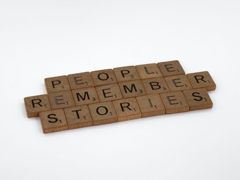
The metric that actually matters isn’t awareness; it’s salience. As my mentor Mark Ritson says, “It’s not about being seen; it’s about being remembered.” Salience is the ability of your brand to be the first thing that comes to a consumer’s mind in a buying situation. At CUT THRU, we don’t build brands that are just visible; we use the science of conversion-centered design to build brands that are psychologically unforgettable.
The Awareness Trap: Why Visibility Isn’t Valuable
The marketing industry is obsessed with awareness. The Content Marketing Institute notes that 89% of B2B marketers prioritise it above all else. This is “The Awareness Trap.” It’s the flawed belief that if you just shout loud enough, people will eventually buy from you. But in the attention recession of 2025, shouting is a failing strategy.
As marketing scientist Byron Sharp proved, brands grow by building broad mental availability through “Category Entry Points”—the cues and situations that make a consumer think of a specific brand. A high awareness score with low salience means people may have heard of you, but they have no idea when or why they should think of you. Your brand is a face in the crowd with no name. It’s a massive, inefficient burn of marketing budget with little to no ROI.
The Salience System: A Framework for Designing Memorable Brands
You don’t build salience by accident. It’s the direct result of a disciplined, strategic approach to design that is relentlessly focused on reducing cognitive load and creating powerful memory structures. Our framework uses the principles of Conversion-Centered Design (CCD) to turn every brand touchpoint into an opportunity to build lasting mental availability.
Pillar 1: Isolate the Message (Encapsulation & White Space)
The Psychology: The human brain can only process a limited amount of information at once. To make a message memorable, you must first make it stand out. White space and encapsulation (framing an element in a clearly defined space) are powerful tools for reducing cognitive load and focusing attention on the one thing you want the user to remember.
The Pitfall: Cluttered, “busy” designs that overwhelm the user with competing messages, ensuring that none of them stick.
In Action: Blossom
For our client Blossom, an investment app, their entire user interface is a masterclass in this principle. The design is clean, minimalist, and uses ample white space to frame a single, powerful call-to-action or a key piece of information. This isolates their core message—”grow your savings”—making it the primary, unforgettable takeaway associated with their brand.
Pillar 2: Create Emotional Cues (Colour & Contrast)
The Psychology: As Rory Sutherland notes, emotion is a powerful trigger for memory. Colour and contrast are not just decorative elements; they are some of the fastest ways to create a non-conscious emotional association with your brand.
The Pitfall: Using bland, low-contrast colour palettes that are “safe” but completely forgettable.
In Action: Talent Recap
The brand identity for Talent Recap is built on a vibrant, high-contrast colour palette of pinks, purples, and blues. This isn’t an arbitrary choice. These colours create an immediate emotional cue of excitement, energy, and entertainment. This powerful, distinctive colour scheme makes their content instantly recognisable in a crowded social media feed, creating a strong and memorable brand block.
Pillar 3: Guide Attention & Action (Directional Cues)
The Psychology: The human eye is naturally drawn to lines, shapes, and images of faces looking in a particular direction. Directional cues are subtle but powerful tools for guiding a user’s attention and creating a logical, memorable path.
The Pitfall: Randomly placed visuals that distract from, rather than support, the primary call-to-action.
In Action: Paperform
For Paperform, a powerful SaaS tool, their landing pages are designed to guide the user on a logical journey. We use a combination of subtle graphical elements, user flow, and even the direction of gaze in imagery to guide the eye from a headline that identifies a problem, to a visual that demonstrates the solution, and finally, directly to the “Start Free Trial” CTA. This creates a clear, intuitive, and memorable path to conversion.
Pillar 4: Build Distinctive Assets (The Mental Filing System)
The Psychology: This is the ultimate goal of salience. Distinctive brand assets are the unique, ownable elements—logos, colours, taglines, sounds, and even product shapes—that act as the filing system for a brand in a consumer’s brain.
The Pitfall: Inconsistent branding that changes with every new campaign, failing to build any lasting memory structures.
In Action: Hyloh
The salience of our client Hyloh, a premium architectural hardware brand, isn’t built on loud advertising. It’s built on the ruthless consistency of their distinctive assets. Their unique, minimalist product silhouettes, their specific typographic style, and their considered, professional tone of voice are applied across every single touchpoint. These assets ensure that when an architect or designer is thinking “premium, minimalist hardware,” Hyloh is the brand that instinctively comes to mind.
Implementation Guide: A Salience Audit
- Audit for Cognitive Load: Review your key landing pages. Are they cluttered and confusing? Or are they using white space effectively to isolate a single, clear message?
- Evaluate Your Emotional Cues: Does your brand’s colour palette evoke a specific, desired emotion? Is it distinctive from your competitors?
- Map Your User’s Gaze: Use a heatmap tool like Hotjar to see where your users are actually looking. Are your directional cues guiding them to the CTA, or are they being distracted by irrelevant elements?
- Codify Your Distinctive Assets: Do you have a clearly defined and consistently used set of brand assets? If not, you are failing to build a mental filing system for your brand.
- Seek an Expert Opinion: Building brand salience is a sophisticated, strategic challenge. An audit from the best branding agency in Sydney can provide a data-driven analysis of your brand’s weak points and a clear roadmap for becoming more memorable.
Common Salience Pitfalls to Avoid
- Overloading Visuals: A cluttered design that tries to say everything ends up saying nothing. It’s a guaranteed way to be forgotten.
- Generic CTAs: A button that just says “Click Here” is a wasted opportunity. A specific, benefit-driven CTA reinforces your brand’s core promise.
- Ignoring Emotion: A cold, purely functional design may be efficient, but it will never be memorable. Emotion is the glue that makes memories stick.
- Skipping the Tests: You might think your design is clear and memorable, but only rigorous A/B testing can tell you what your audience actually remembers.
The Future of Salience
The future of branding will be a battle for mental availability. As AI-powered search and recommendation engines become more dominant, the importance of having strong, distinctive brand assets that can be easily recognised by both humans and algorithms will be paramount. Brands that have invested in building true salience will be the ones that are recommended. Brands that have only chased awareness will be invisible.
Is your brand shouting but not being remembered? Partner with CUT THRU, the leading branding agency in Sydney and New York, to build a salient brand that comes to mind when it matters most.
Click here to get a quote for a brand consumers can’t forget.
About The Author
Jonathan Sankey is founder of CUT THRU, recognised for conversion-centred design and product-market fit testing. His evidence-based approach has driven growth for global brands and unicorn startups in Australia and America. A Netty Award winner (2023, 2024), he blends data with execution.
Click Here to Follow Jonathan on LinkedIn for a New Brand Hack Every Week.